
Summary: Luis Calćada, an illustrator at the European Southern Observatory, turns scientific data into vivid space art—one piece even appeared on the cover of Nature. He left astronomy for art because visual beauty can spark curiosity, but he negotiates carefully with scientists to keep illustrations faithful to the science. Calćada warns that compressed timescales and saturated color can mislead, so captions, transparency about inference, and public engagement—especially around AI—are essential.
Turning Data Into Cosmic Art: Luis Calćada on Beauty, Accuracy, and the Ethics of Space Illustration

Lead image: This illustration shows what the luminous blue variable star in the Kinman Dwarf galaxy could have looked like before its mysterious disappearance. A luminous blue variable star some 2.5 million times brighter than the sun. Stars of this type are unstable, showing occasional dramatic shifts in their spectra and brightness. Credit: Luís Calçada
Luis Calćada, an illustrator at the European Southern Observatory (ESO) near Munich, transforms scientific data and simulations into vivid, cinematic images of the cosmos. His colorful renderings—one of which recently graced the cover of Nature—depict events that are often invisible to the naked eye or occur across immense distances and timescales.
Calćada’s path to astronomical art began in childhood after he discovered Carl Sagan’s Contact in a bookstore. The book’s shadowy, enigmatic cover made a lasting impression; he read everything by Sagan he could find and later studied astronomy and physics. He ultimately shifted from formal science to art, drawn by the power of imagery to spark an emotional curiosity about how the universe works.
Beauty as a Gateway to Curiosity
Your images are lush and cinematic. Do you think beauty can ever get in the way of scientific truth?
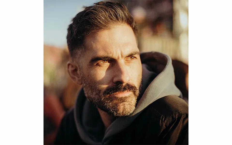
THE INTERPRETER:Luis Calćada's images bring the beauty and magic in complex astronomy to life.Courtesy of Luís Calçada
Calćada argues that beauty is a catalyst for curiosity. A striking visual can prompt people to ask questions and seek understanding. He notes that when people are drawn to mysticism or pseudo‑science, it often reflects a hunger for wonder that science itself can satisfy if communicated well.
Negotiating Artistic License and Scientific Accuracy
Have you ever argued with a scientist over artistic license?
At ESO, reactions vary. Some researchers are delighted to see their data interpreted visually; others focus on technical fidelity and want adjustments. Calćada says those conversations are productive: the goal is to remain true to the science while choosing which elements best communicate the story to a general audience. What is obvious to specialists may be opaque to most viewers, so the illustrator’s role is partly editorial.

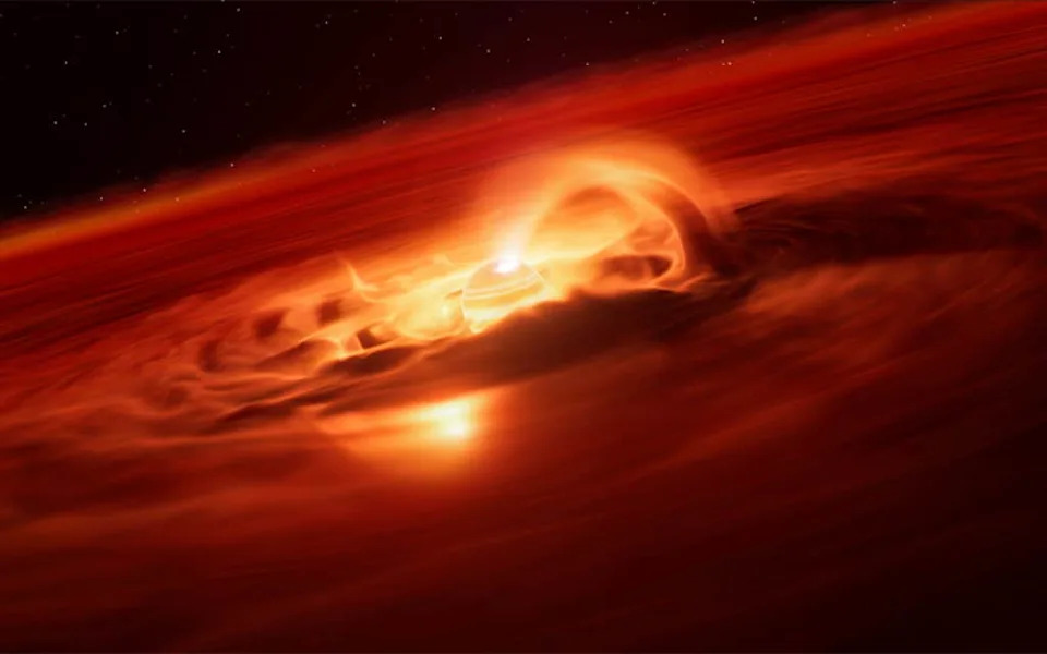
SUPERNOVA:This artist’s impression shows a star going supernova. About 22 million light-years away the supernova, SN 2024ggi, exploded in the galaxy NGC 3621. Using the ESO’s Very Large Telescope, astronomers managed to capture the very early stage of the supernova when the blast was breaking through the star’s surface.Credit: ESO/L. Calçada
Can you give an example?
He recalls a simulated supernova explosion (published in November 2025) that led to extended negotiations with a scientist who was attentive to minute details. The animation compresses processes that, in reality, unfold over different timescales: an initial polar outflow might occur almost instantaneously, other components over seconds, and additional ejecta over days. The animation bundles these into roughly 20 seconds to tell a coherent visual story.
Because of such compression, Calćada emphasizes the importance of clear captions and labels. ESO provides explicit copy for journalists, explaining that an image is an artist’s impression. However, once images are shared across the web, captions are frequently lost, and visuals can be misinterpreted.
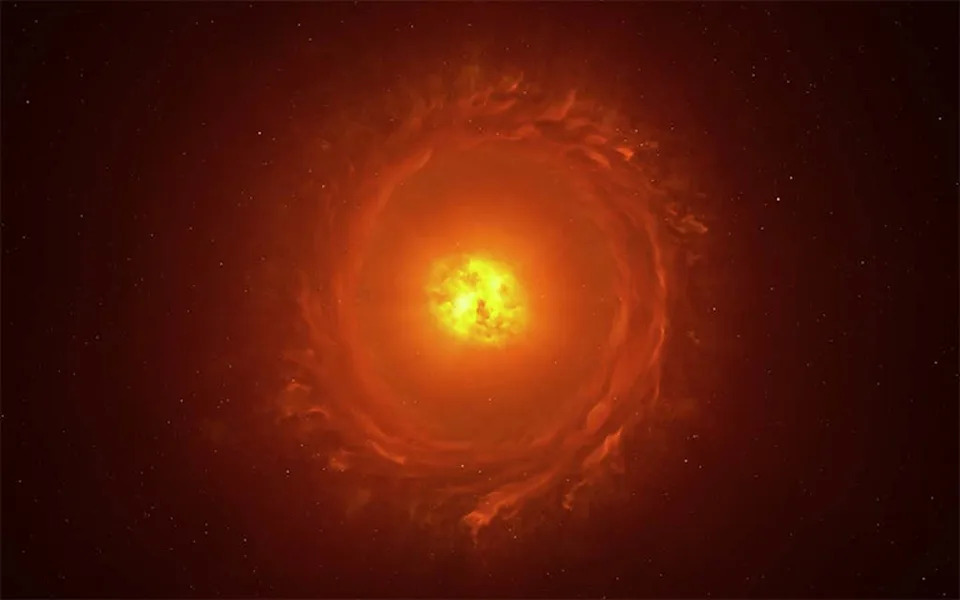
GONE ROGUE:Astronomers have identified an enormous "growth spurt" in a so-called rogue planet. Unlike the planets in our solar system, these objects do not orbit stars, free-floating on their own instead.The new observations,made with the European Southern Observatory’s Very Large Telescope, reveal that this free-floating planet is eating up gas and dust from its surroundings at a rate of 6 billion tonnes a second. This is the strongest growth rate ever recorded for a rogue planet, or a planet of any kind, providing valuable insights into how they form and grow.Credit: Luís Calçada
Risks, Perception, and the Role of Visuals
What harm can these images cause?
Calćada qualifies "harm" but warns that dramatic, colorful illustrations can create a false impression of how the universe appears to the human eye: most of the sky looks black to us, and many phenomena are far less visually spectacular than artists portray. He recounts showing telescope views to the public and encountering disappointment when audiences expect the same colors and drama they see in illustrations.
Are your images hypotheses or explanations?
DISTANT STAR:Reconstruction of the star WOH G64, the first star outside our galaxy to be imaged in close-up. It is located at a staggering distance of over 160,000 light-years away in the Large Magellanic Cloud. This impression showcases its main features: an egg-shaped cocoon of dust surrounding the star and a ring or torus of dust.Credit: Luís Calçada
The team is careful about speculative content. Their priority is to communicate scientific findings and help discoveries reach broader audiences—sometimes a compelling image helps a study land on a magazine cover or in mainstream media—but they try to signal when an image represents inference or artistic interpretation rather than direct observation.
Realism, AI, and Cutting Through the Noise
One controversial reaction to the supernova illustration was that it looked "too realistic," which some critics felt could mislead. That response prompted internal discussion about how and where such images should be used. Calćada also highlights conversations about the ethical use of AI: as the internet fills with bright, AI‑generated images, high‑quality work produced in close collaboration with scientists risks being drowned out.
Calćada engages with the public on platforms such as Reddit to explain the process behind the images. He found that walking people through the scientific and artistic decisions often changes perceptions and helps viewers appreciate the work’s grounding in research.
Conclusion
For Calćada, the ultimate goal is communication: creating images that ignite curiosity while remaining honest about what the data show. Clear captions, scientist collaboration, and public engagement are essential tools for ensuring that beautiful space art educates rather than misleads.
Help us improve.


