Key takeaway: Some 'hockey-stick' climate charts amplify perceived warming through visual choices—ratios, changing coverage, and selective baselines—rather than by revealing new physical facts. Re-analyses that account for station coverage and measurement uncertainty show a gradual acceleration in warming since about 1960 and a clear decline in record-cold events, which is itself a strong indicator of climate change. Responsible visuals emphasize global mean anomalies, include uncertainty, and clearly document data limits to support sound public discussion and policy.
How ‘Hockey-Stick’ Charts Can Mislead: Visual Tricks, Data Limits, and Better Alternatives

Adani Samat(Adani Samat)
Charts that spike sharply at the right-hand edge—the so-called "hockey-stick" graphs—can be powerful communicators. But presentation choices such as using ratios, selective baselines, or incomplete data coverage can amplify the visual impact and obscure what the underlying measurements actually show. This article explains the common pitfalls, reviews prominent examples and critiques, and suggests clearer ways to visualize climate change.
Why Some Visuals Exaggerate
Visual choices matter. Plotting ratios, stitching different data series together without clear distinctions, or ignoring changes in measurement coverage across time can produce a striking graphic that overemphasizes outliers or artifacts rather than revealing long-term climate signals. That does not mean there is no warming—just that some charts make the pattern look more dramatic than the raw data warrant.
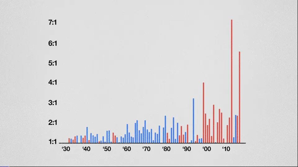
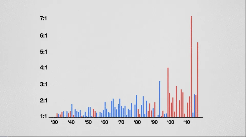
Ratio Charts and the Record-High/Record-Low Example
The U.S. government's chart that shows the ratio of record-high to record-low daily temperatures is often cited as alarmist. As noted by theoretical physicist Steven Koonin, converting absolute counts to a ratio can make the red (record-high) line rise even when the number of record-high days remains roughly steady; the increase can reflect a decline in record-cold days instead. Because the denominator falls, the ratio grows—producing a visually alarming result that does not directly show an absolute rise in record-high events.
Why Early Records Matter
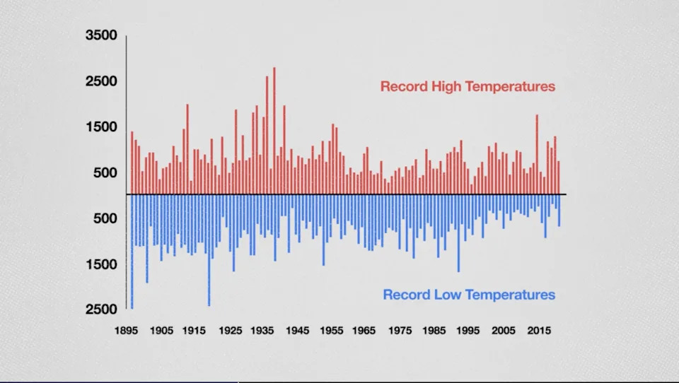
Records are defined relative to the start of an observational series (for example, 1895 in one U.S. data run). Early in a record, many "new" highs or lows occur simply because the historical window is short. As the window lengthens, new records become rarer. This mechanical effect can distort ratios and trends unless charts explicitly account for it.
Case Studies
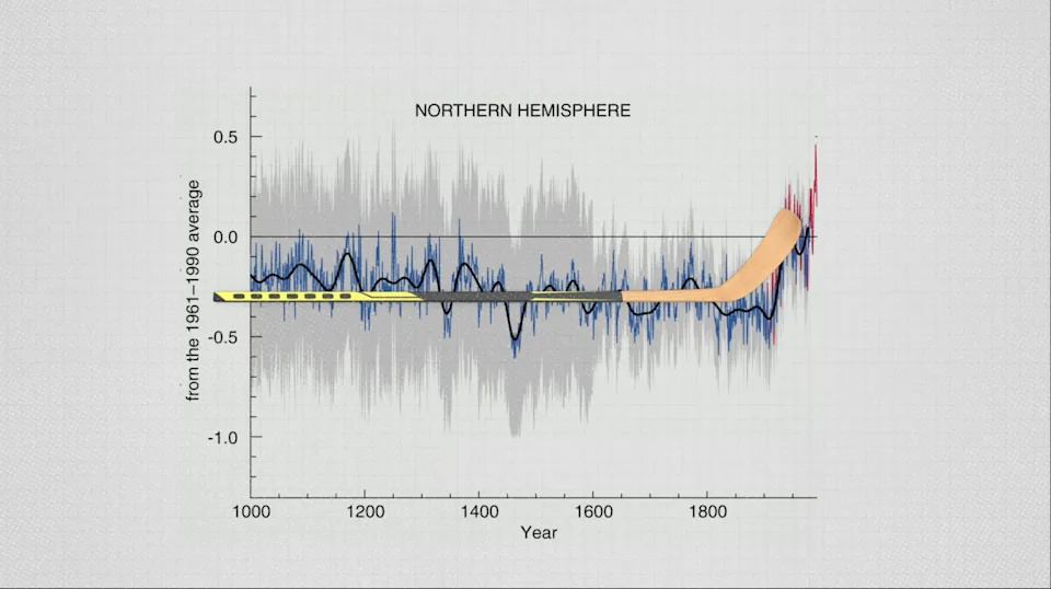
Michael Mann's 1998 Reconstruction
Michael Mann’s 1998 "hockey stick" reconstruction combined multiple proxy records to estimate past hemispheric temperatures. The work was controversial: critics pointed to methodological choices and called for greater transparency, while subsequent research and later reconstructions broadly supported the conclusion that recent warming is unusually rapid in the context of the last millennium. It’s important to distinguish methodological debate about reconstructions from the larger body of evidence for 20th–21st century warming.
Steven Koonin’s Replotting of U.S. Records
Koonin re-plotted U.S. record-high counts (not ratios) and argued the raw counts do not show a clear increasing trend, while the ratio chart does. Critics have accused Koonin of selective emphasis and of downplaying the significance of declining cold records. The key takeaway is methodological: charts should make clear exactly what they measure (counts vs. ratios, records vs. averages) and what inference is and is not supported.
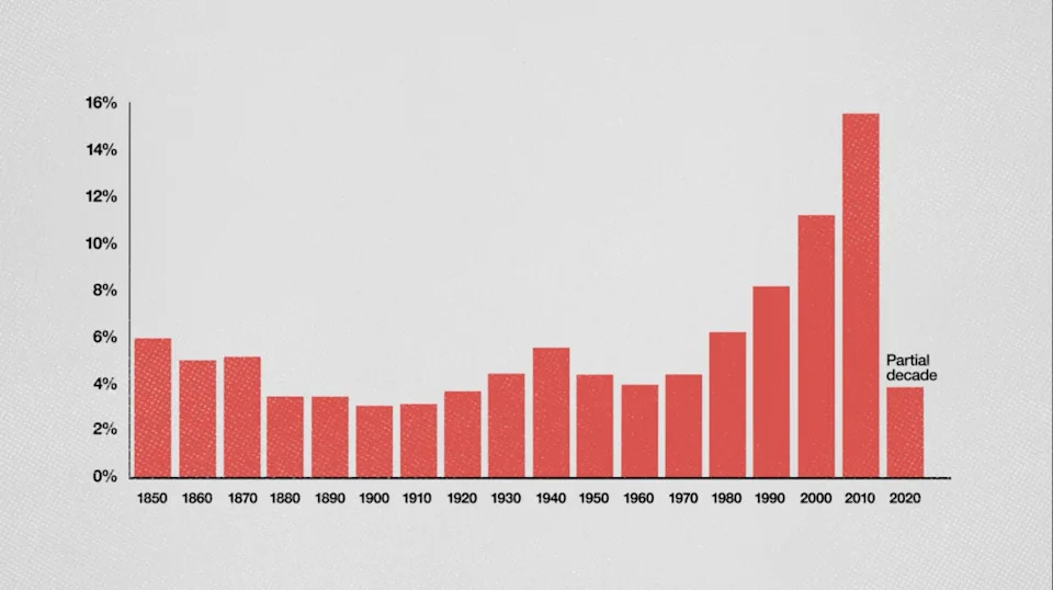
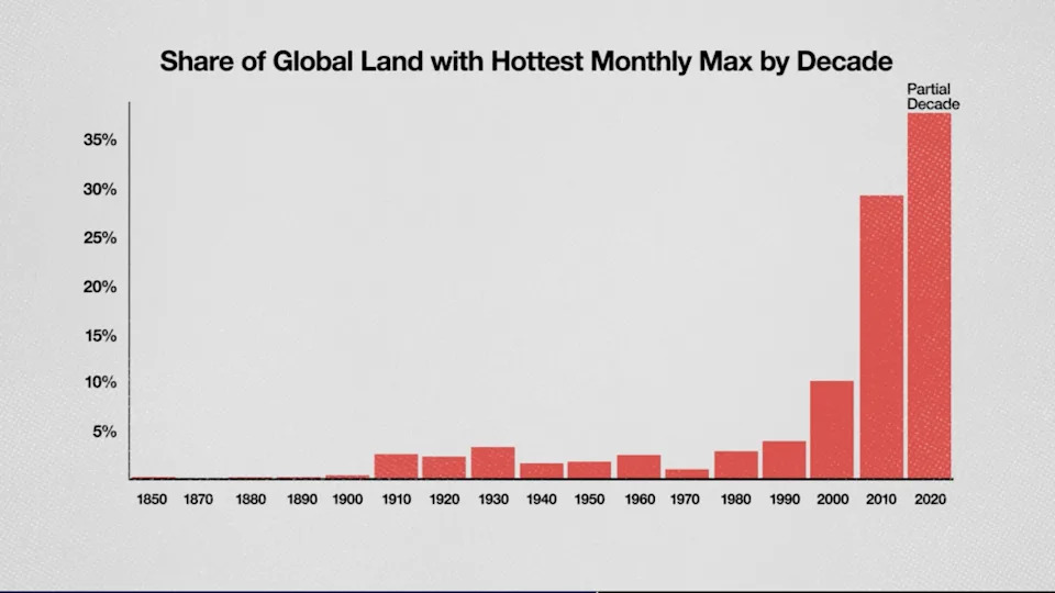
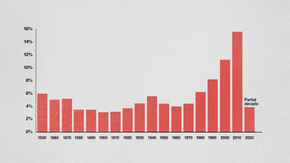
Global Percent-of-Places-with-Record-Highs (Zeke Hausfather)
Zeke Hausfather produced a chart showing the fraction of places that recorded their warmest monthly temperatures by decade. That chart indicates a clear upward trend, but like many long-span datasets it is affected by improving station coverage and data quality over time. When analysts adjust for changing station counts and measurement uncertainty—or prorate partial-decade data—the visual impression softens into a more gradual, statistically supported acceleration since about 1960 rather than a sudden 21st-century explosion.
Better Ways To Show Climate Change
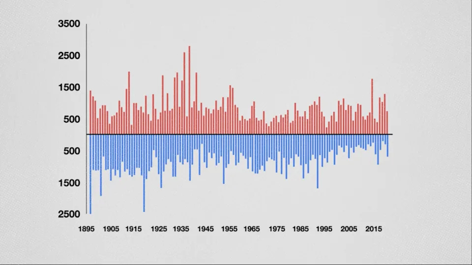
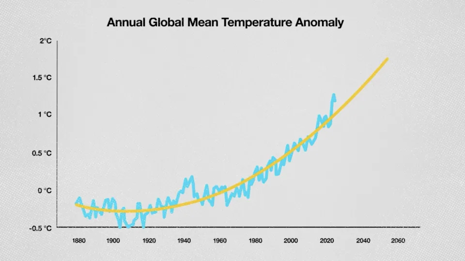
Prefer global-mean anomalies for climate trends. Annual global mean temperature anomalies (with uncertainty bands and simple trend fits) directly track the long-term signal that defines climate change and avoid the outlier-driven noise of record counts. Another informative display is a paired chart of record-highs and record-lows: the near disappearance of record-cold months is a clear and important fingerprint of a warming world.
Responsible visualization practices include annotating datasets, showing uncertainty ranges, avoiding misleading ratios, and explaining changes in spatial or temporal coverage.
Policy and Communication
Visuals that overstate or understate the evidence both harm public discourse. Accurate, transparent charts build trust and enable sensible policy decisions. The scientific community and communicators should prioritize clarity: show what was measured, how it was processed, and what the limits are.
Conclusion
Hockey-stick visuals can be informative, but they also invite scrutiny of methods and presentation. Adjusting for data coverage and uncertainty generally produces a picture of accelerating warming beginning mid-20th century and a pronounced drop in record-cold events—findings that are consistent with mainstream climate science. Clear, well-annotated graphics that focus on global averages and uncertainty are the best way to inform policy and the public.
Adani Samat(Adani Samat)
Adani Samat(Adani Samat)
Adani Samat(Adani Samat)
Adani Samat(Adani Samat)
Adani Samat(Adani Samat)
Adani Samat(Adani Samat)
Adani Samat(Adani Samat)
Adani Samat(Adani Samat)
Adani Samat(Adani Samat)
Adani Samat(Adani Samat)
Adani Samat(Adani Samat)
Help us improve.