The White House’s Jan. 30 chart titled "U.S. STEEL PRODUCTION INCREASES" uses a truncated Y-axis that makes 2025 appear much larger than 2024. In reality, production rose from 80.8 Mt in 2024 to 81.8 Mt in 2025 — about a 1.24% increase. Experts warn that zooming a vertical axis to a narrow range can exaggerate small changes; a decade-long view shows the 2025 uptick is modest compared with 2020–2021 swings.
Fact Check: White House Steel Chart Exaggerates 2025 Gain With Truncated Y-Axis

Lead Stories says: It's 1.24%
The White House’s Jan. 30 social post included a chart titled U.S. STEEL PRODUCTION INCREASES that visually makes 2025 look roughly twice as large as 2024. That impression is misleading: the underlying data show U.S. steel production rising from 80.8 million tons in 2024 to 81.8 million tons in 2025 — an increase of about 1.24%, not 100%.
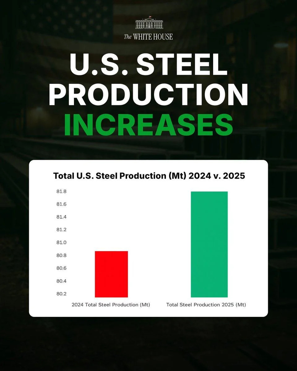
Image source: Lead Stories screenshot of post at https://x.com/WhiteHouse/status/2017370992436249025.
What Went Wrong
The chart’s Y-axis was zoomed in to begin near 80.2 million tons. By truncating the vertical axis to a narrow range, a small absolute change (1 million tons) appears visually dramatic. This technique is known as a truncated Y-axis, and data-visualization experts warn it can exaggerate apparent growth or decline.
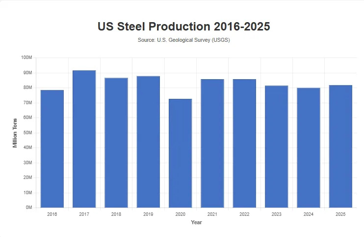
Image source: Lead Stories chart of data from the White House and fromusgs.gov/periodicals-iron-steel.pdf
Expert Warning
Researchers such as Michael Correll have documented how truncating the Y-axis can mislead viewers about the magnitude of change. Presenting data with an axis that does not start at zero or that uses a very tight range should be accompanied by clear labeling and context to avoid creating a false impression.
Context Matters
When placed in a longer-term context — for example, a decade of U.S. Geological Survey production data — the 2024→2025 uptick is modest. Larger swings occurred in 2020 (a steep pandemic-era drop) and 2021 (a sizable rebound). Plotting the same data on a Y-axis that starts at zero or uses a broader range makes the 1-million-ton increase look relatively small.
Bottom Line
The White House graphic uses axis scaling that magnifies a modest numerical increase. The correct numeric change is approximately 1.24% (80.8 Mt → 81.8 Mt), so the chart’s visual impression of a doubling is the result of visual formatting, not of the underlying data.
Data sources: White House social post (Jan. 30) and U.S. Geological Survey production figures.
Help us improve.