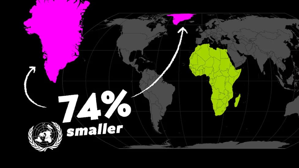
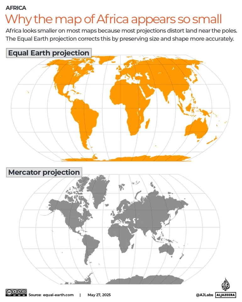
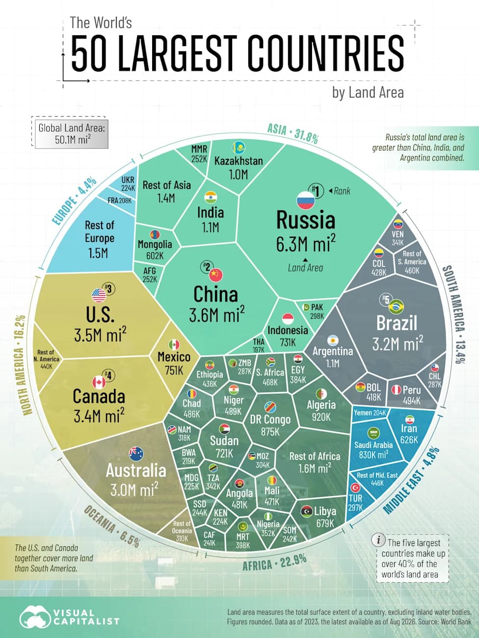
The UN General Assembly adopted the 'Correct the Map' resolution and approved the Equal Earth projection to present continents, notably Africa, in truer proportion — Africa is about 14 times larger than Greenland. The long-used Mercator map (1569) preserves compass bearings but inflates polar areas and shrinks equatorial regions, shaping perceptions. Alternatives such as Equal Earth and Gall–Peters reduce area distortion but sacrifice shape or navigational properties. Every flat map is a compromise designed for a specific purpose.
UN Adopts New World Map: How Different Projections Get Size — and Power — Wrong
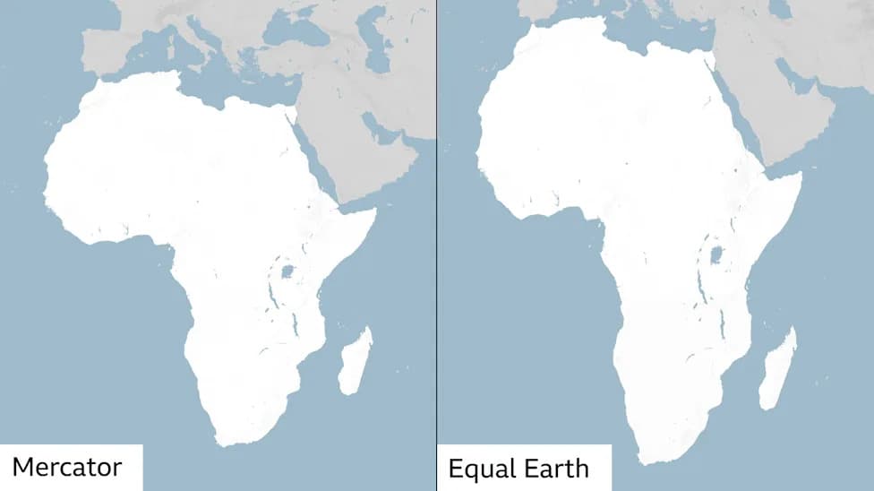
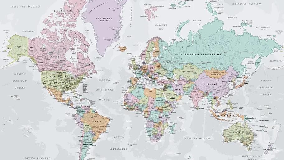
The Mercator projection is the map widely used across the globe but inaccurately depicts the sizes of countries and continents [BBC]
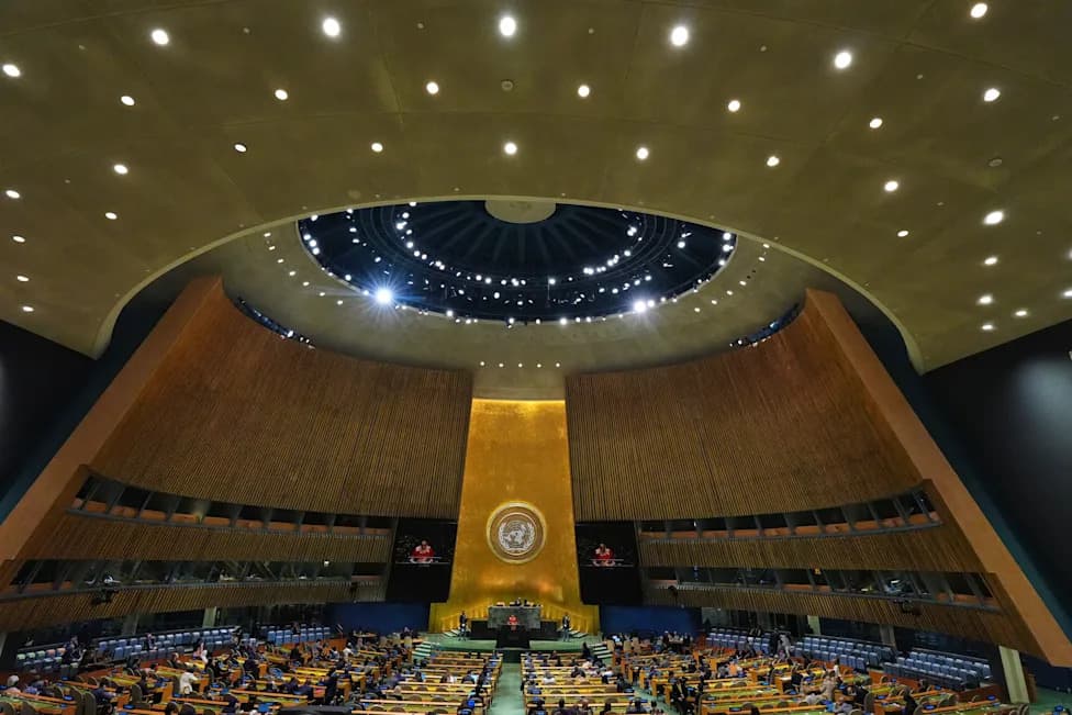
The United Nations General Assembly has adopted the 'Correct the Map' resolution and approved the Equal Earth projection to give a fairer visual representation of continents — notably to show Africa at its true scale, roughly 14 times larger than Greenland. The move highlights a broader truth about maps: every flat map is a compromise that emphasizes some geographic truths and hides others.
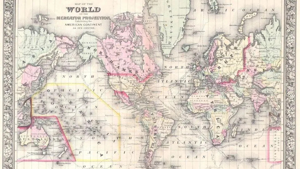
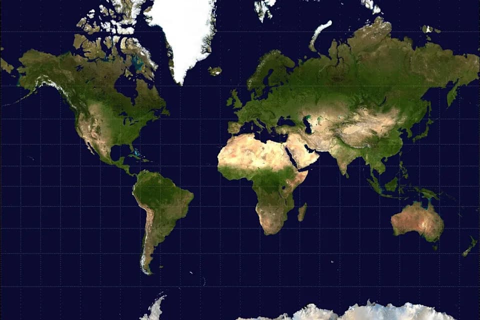
The Mercator projection has been around since the 16th Century and was vital for navigating the oceans [Universal Images Group via Getty Images Images]
Why Projections Differ
Cartographers have long struggled to represent the curved surface of the Earth on a flat rectangle. Different map projections preserve different properties: area, shape, distance or direction — but no projection can perfectly preserve all of them at once.
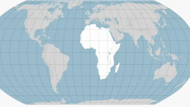
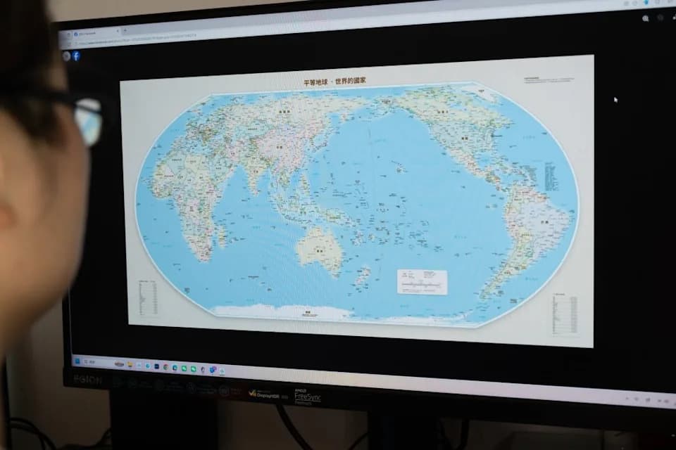
The Equal Earth map aims to represent landmasses' area more fairly [BBC]
The Mercator Projection (1569)
Created by Gerardus Mercator in 1569 to aid ocean navigation, the Mercator projection preserves compass bearings, which made it invaluable to sailors. To keep angles accurate, Mercator stretched the spacing of latitude lines away from the equator. The result: regions near the poles appear much larger than they are and equatorial regions appear smaller.
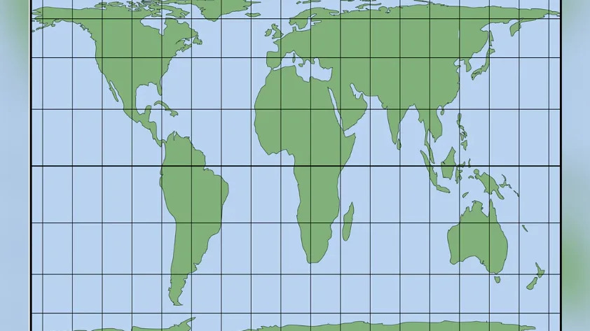
The Peters map projection gives a fairer idea of land area but distorts shape [BBC]
James Cheshire, professor of cartography at University College London: 'You can preserve area, or you can preserve shape, or you can preserve distance and direction, but not everything at once perfectly.'
Why This Matters
Because people often perceive size as importance, distortions can shape political and economic perceptions. Critics argue that the Mercator view has downplayed Africa's scale, population and investment potential. Kenyan geographer Kioko Muendo summed it up: 'Maps are more than just guides for travellers — they shape how regions are perceived politically and economically.'
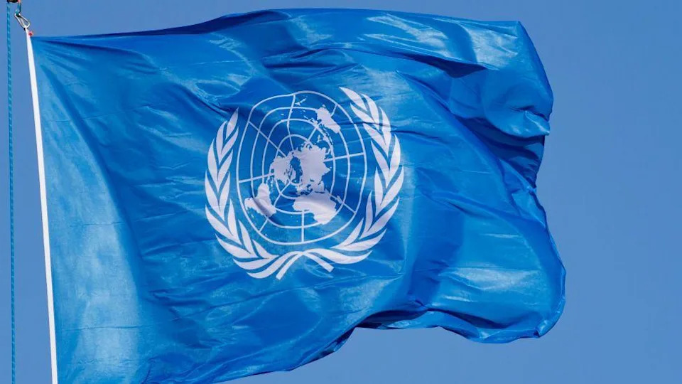
The UN flag is centred on the North Pole [NurPhoto via Getty Images]
Equal Earth Projection (2018)
Developed by a team of cartographers in 2018 and inspired by the Robinson projection, the Equal Earth projection preserves relative land area more accurately while retaining a familiar global outline. It was supported by African Union members and endorsed through the UN's recent resolution. However, it does not preserve straight-line compass bearings or precise distances for navigation.
[Corbis via Getty Images]
Peters (Gall–Peters) Projection
Popularized by Arno Peters in the 1970s and based on an 1855 projection by James Gall, the Peters projection preserves relative area but distorts shapes — stretching equatorial zones and compressing polar ones. It fixes the Greenland–Africa size illusion but renders continental outlines that may look unfamiliar and unsuitable for navigational bearings.
Other Projections and Choices
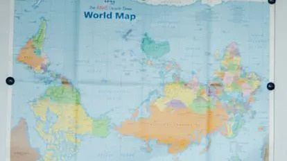
The azimuthal equidistant projection preserves accurate distances and directions from a chosen central point — the UN emblem is an example, centered on the North Pole. Some maps invert orientation (south-up) to challenge the cultural bias of 'north-up' conventions. Each projection is a tool tailored to a purpose: education, navigation, thematic mapping, or political messaging.
Bottom line: No flat map gives a complete truth. The UN's move to adopt the Equal Earth projection recognizes the importance of area-accurate maps for representation and education, while also reminding readers to consider which projection best fits their purpose.
Help us improve.