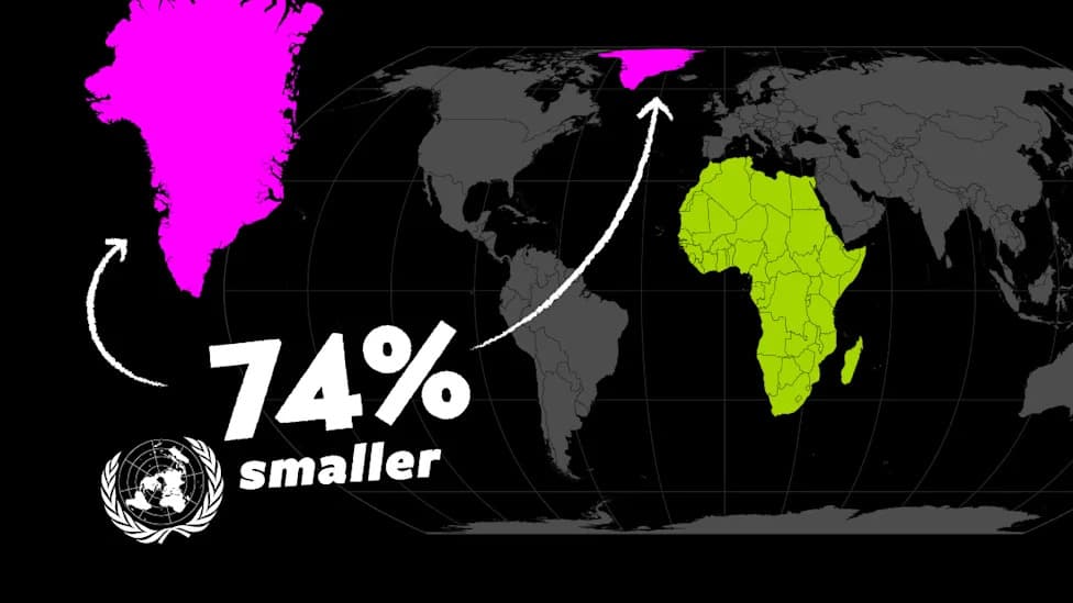
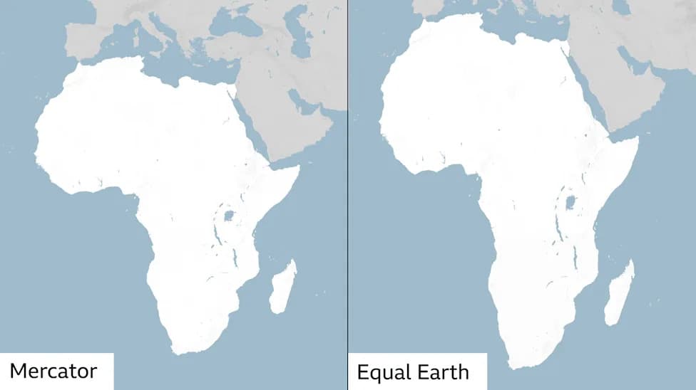
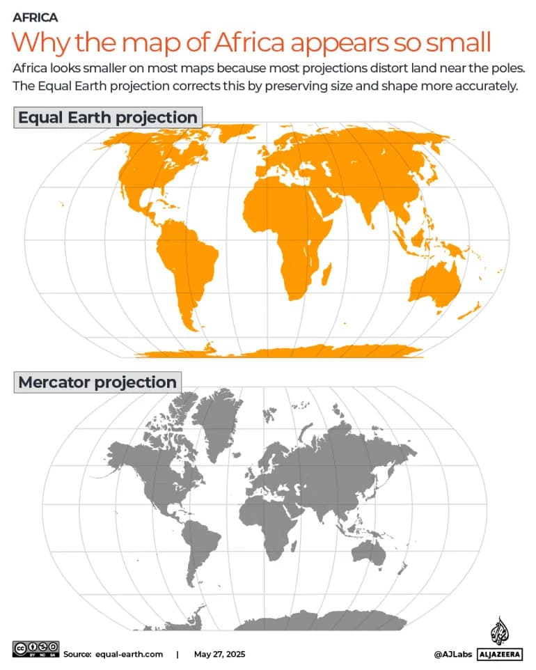
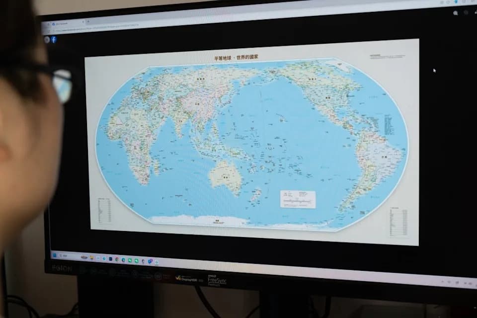
UN Adopts "Correct the Map" Resolution. On September 4, 2026, the UN General Assembly urged use of area-accurate map projections like the 2018 Equal Earth map instead of the Mercator projection. Mercator, created in 1569 for navigation, preserves compass bearings but greatly distorts land area—making polar regions look much larger and equatorial continents smaller. The resolution passed 164 in favor, six abstentions, and one vote against (the United States).
How the Mercator Map Distorts Our View of the World — and Why the UN Is Calling for a Change
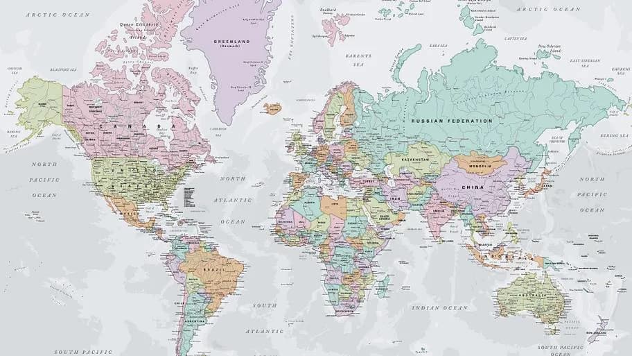
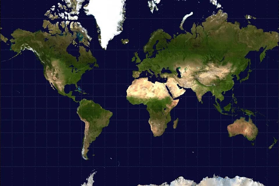
Modern Mercator projection map | Bardocz Peter / Shutterstock
On September 4, 2026, the United Nations General Assembly adopted a nonbinding resolution called "Correct the Map", encouraging nations, institutions, and educators to favor area-accurate projections—such as the 2018 Equal Earth projection—over the traditional Mercator projection for world maps. The move aims to correct long-standing visual misperceptions about the relative sizes of continents and countries.
Background
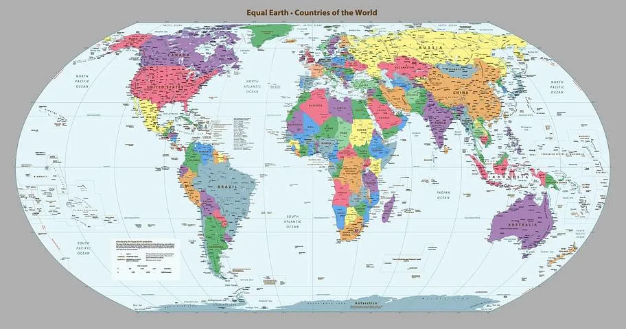
The Equal Earth projection map, 2018 | SamKal / Shutterstock
The Mercator projection, created by Flemish cartographer Gerardus Mercator in 1569, was designed for navigation: it preserves angles and compass bearings so that a straight line on the map corresponds to a constant compass heading at sea. That property made it enormously useful for sailors, but it comes at a cost: Mercator grossly distorts area, increasingly stretching regions farther from the equator.
Why the Resolution Matters
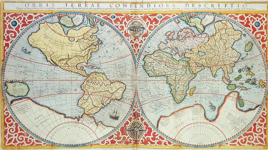
Early Mercator map | Heritage Images/GettyImages
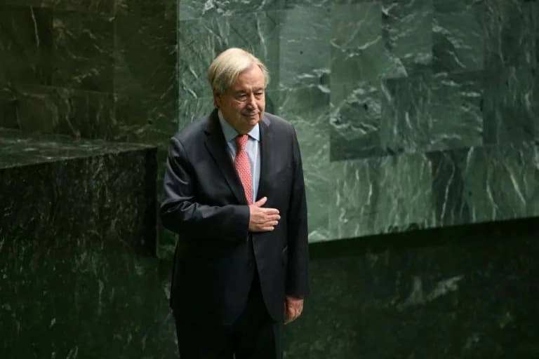
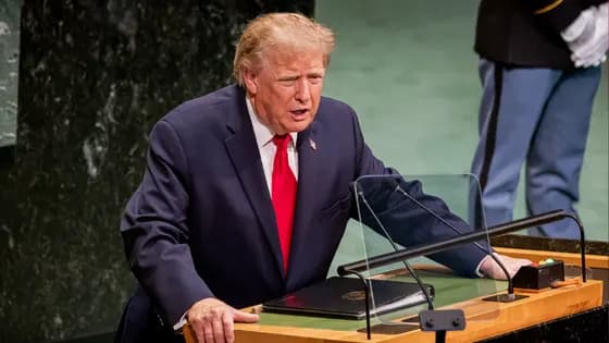
Togo introduced the resolution. As Foreign Minister Robert Dussey put it before the vote: "Maps shape our understanding of the world. They guide education, nourish the imagination, and influence collective perceptions." The resolution passed with 164 member states voting in favor, six abstentions, and the United States the sole country voting against.
Five Ways the Mercator Projection Misleads
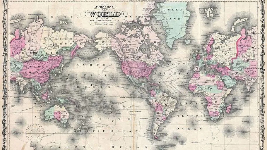
Johnson Map of the World on Mercator Projection | Sepia Times/GettyImages
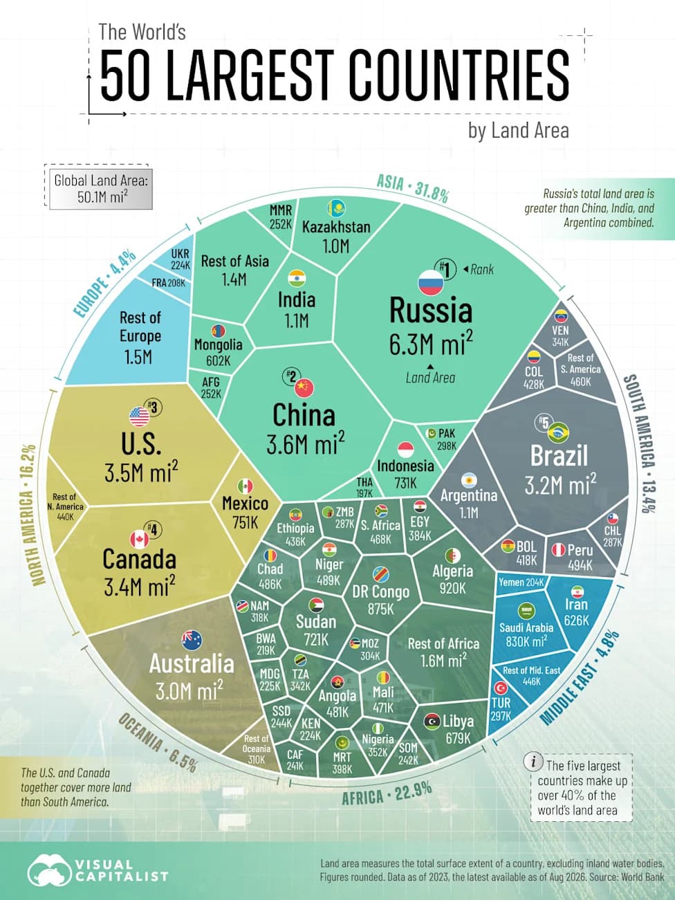
1. Africa Looks Much Smaller Than It Is. Many Mercator world maps make Africa appear similar in size to Greenland and smaller than Russia. In reality, Africa covers roughly 11.7 million square miles, versus Greenland's ~836,330 square miles—making Africa about 14 times larger than Greenland. Russia's area (~6.6 million square miles) is also smaller than Africa's by a significant margin.
2. Polar Regions Are Exaggerated. Because Mercator's scale increases with latitude, landmasses near the poles are greatly inflated. Antarctica can look enormous—sometimes larger than Eurasia—while in truth Antarctica is about 5.5 million square miles, less than twice the size of Australia (~2.9 million square miles) and under half the size of Africa.
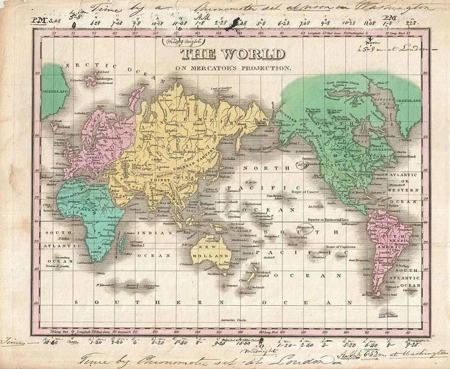
Finley Map of the World on Mercator's Projection | Sepia Times/GettyImages
3. South America Appears Too Small Compared With Europe. On many Mercator maps, South America and Europe can look similar in size. The true figures tell a different story: South America is about 6.9 million square miles, while Europe covers roughly 3.8 million square miles—making South America nearly 1.8 times larger.
4. High-Latitude Regions (Canada, Alaska) Are Stretched. Northern Canada and Alaska appear oversized on Mercator maps. Alaska can look at least three times larger than Mexico on some renderings—even though Alaska is about 665,384 square miles and Mexico is about 761,610 square miles.
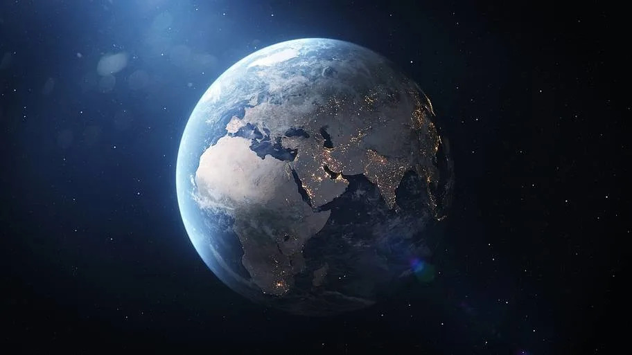
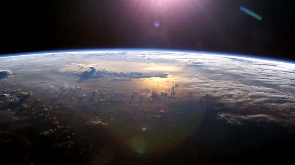
Earth from space - simulation | Fordelse Stock / Shutterstock
5. The Map's Visual "Center" Can Be Misleading. Typical Mercator layouts often place Europe near the visual center and position the equator low in the frame, subtly reinforcing a Eurocentric sense of centrality. No flat projection can perfectly preserve shape, area, distance, and direction simultaneously; the Equal Earth projection prioritizes accurate area while maintaining pleasing, familiar continental shapes and relative positions.
Expert Perspective
“If you're using the Mercator map as a world map, say, in the classroom, students would just have a completely warped view of the size of countries in the world,” said Tom Patterson, co-creator of the Equal Earth projection (NPR). University College London cartography professor James Cheshire has explained that Mercator's design goal was navigational: to make rhumb lines straight so compass bearings could be used easily (BBC).
Alternatives and Practical Impact
Area-preserving projections (also called equal-area projections) such as Equal Earth, Mollweide, and Gall-Peters display landmasses in proportion to their actual surface areas. For classrooms, media, and public signage where accurate relative size matters, these projections reduce distortion-driven misconceptions. For navigation and certain technical uses, Mercator still has practical advantages.
Conclusion
The United Nations resolution does not ban the Mercator projection, but it signals a broader push to rethink how maps shape public understanding. Whether through adopting equal-area projections in education and public resources or by teaching map literacy (including when and why different projections are used), the goal is to give people a more accurate visual sense of our planet.
Originally reported by Mental Floss; this version consolidates and clarifies key facts and comparisons about map distortion and the UN's "Correct the Map" resolution.
Help us improve.