Coca‑Cola has unveiled a global brand refresh across more than 200 markets, returning the classic script to a vertical orientation on cans and unifying packaging across formats. Coca‑Cola Zero Sugar is redesigned to sit closer to the classic red while keeping a black Dynamic Ribbon and a clear "Zero Sugar" label. Flavoured variants will feature fruit graphics within the logo, Diet Coke remains unchanged, and North America can expect the new packaging in 2027.
Coca‑Cola Flips Its Iconic Script and Unifies Packaging in a Global Rebrand
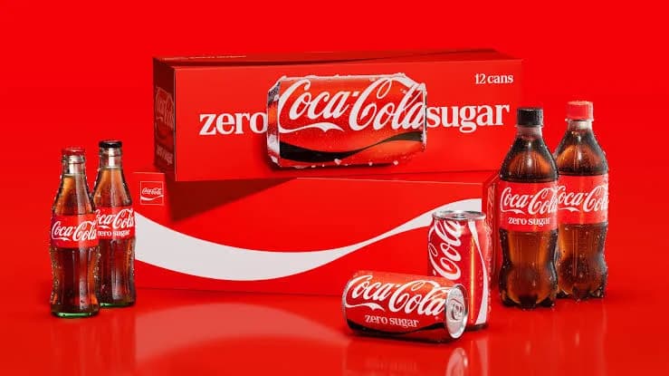
The Coca-Cola Company is rolling out a giant visual overhaul across 200 markets, updating classic cans, Zero Sugar, and flavored sodas with a unified new look. ©Image Credit: Coca-Cola
The Coca‑Cola Company has launched a major global brand refresh that will appear across more than 200 markets. The update keeps the brand's century-old visual heritage while unifying the look of cans, bottles, multipacks and digital apps worldwide.
What’s Changing
The most visible change on shelves is the return of the Coca‑Cola script to a vertical orientation on the classic red‑and‑white cans. After nearly a decade with a horizontal logo, the script will now run up the side of the can.
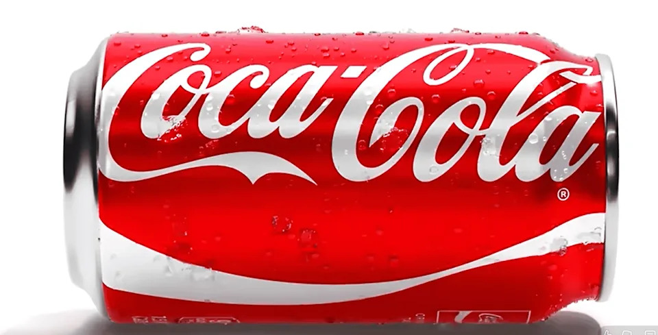
Coca-Cola flips its classic logo vertical in a huge global brand refresh coming everywhere soon. ©Image Credit: Coca-Cola
Coca‑Cola Zero Sugar receives a prominent redesign that brings it closer to the classic Coca‑Cola red while preserving clear product distinction. The bold black wordmark is replaced by lettering that leans toward the traditional red styling and is complemented by a black Dynamic Ribbon. To avoid confusion, all Zero Sugar cans and bottles will display "Zero Sugar" directly beneath the main script.
Flavoured variants (Vanilla, Cherry, Lime, etc.) will include a colourful depiction of the fruit or flavour incorporated inside the script, with the flavour name printed neatly below. Coca‑Cola Caffeine Free will feature a light golden hue applied to the logo and type on its red can.
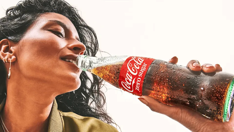
Coca-Cola Zero Sugar and Classic Coke now feature a unified look with bold typography to make telling them apart even easier. ©Image Credit: Coca-Cola
Multipacks are being simplified: cardboard cartons will replace the stretched logo with a clean horizontal photograph of an actual Coca‑Cola can on the front panel.
Diet Coke is notably unchanged in this round of updates. Industry observers suggest Coca‑Cola is maintaining Diet Coke as a distinct brand identity, which may be why it was left out of the refresh.
Rollout Schedule
The redesign is already rolling out across Latin America, Europe, the Middle East and Asia. North American consumers should expect the new cans and packaging to appear on U.S. and Canadian shelves in 2027.
Note: The company says the refresh emphasizes its most "unmistakable" assets rather than abandoning its historical identity.
Help us improve.